
Have you created a great lead magnet, but are still struggling to grow your email list? The fix might just lie in optimizing your opt-in page, so you can convert more of those casual browsers into business leads.
If you want your opt-in page to convert, it needs to clearly showcase why this lead magnet is worth the reader’s time (and contact information). And that comes down to the right blend of copy and visuals.
Whether you’re building out a full-blown evergreen funnel or just getting your email marketing game off the ground, this post will give you strategies for maximizing the conversion power of your opt-in page to get more downloads (and subscribers).
What is an opt-in page?
An opt-in is a free thing that you give your audience in exchange for their contact information, usually their name and email address. It might also be called a lead magnet, freebie, or content upgrade.
Your opt-in page is the place where people go in order to get access to that lead magnet. It usually performs best as a standalone landing page that is solely dedicated to sharing information about the opt-in and its creator, and giving visitors an obvious way to access it.
Why optimize your opt-in page
You likely invested a significant amount of time (and maybe even cash) into creating a great lead magnet — but your job doesn’t end there. If you want to get that download into the hands of ideal clients (and grow your email list as a result), you need to clearly showcase its value.
Instead of putting some bare bones landing page together, crossing your fingers, and hoping that the right people will download it, you need to refine that page and strategically optimize it to convince people to download your lead magnet.
At the end of the day, you have to sell your freebie. That may seem like a weird concept, but it’s important to recognize that your client’s email address is valuable. Why should someone let you take up precious space in their inbox?
If you want your opt-in page to convert, it needs to clearly communicate what visitors will get out of trading their email address for it; not just the tangible lead magnet, but why it matters. And that’s where the following tips come in.
Tip 1: Understand your audience
It’s important to remember that many (maybe even most) people landing on your opt-in page are cold leads, meaning they’ve never interacted with your business before. This is especially true if you’re driving traffic to your landing page from Facebook ads, Pinterest pins, and other business’ online communities.
In order to convert that colder traffic, you need to understand who these people are. Think about the audience you’re trying to sell to in your business, and the specific group within that audience you created your lead magnet for.
Your opt-in should solve some aspect of a problem that your target audience has and/or provide them with a small solution. It’s important to get clear on what those wants and needs are and what bigger desires they might be attached to so you can bring all that insight into your opt-in page copy.
Tip 2: Keep your opt-in form above the fold
There are plenty of things you can do on your opt-in page to make your freebie more compelling. But if you’ve already done a fantastic job of convincing someone they need your lead magnet before they land on your opt-in page (such as in an email or Facebook ad copy), we need to make sure they can get access to it ASAP.
The easiest way to do this is to make sure you have at least one opt-in form above-the-fold (i.e. that first section that page visitors see). You want them to be able to swap their email address for your value-packed freebie without having to scroll.
Tip 3: Only ask for need-to-know info
Your opt-in page is not the place to ask people for their birthday, where they live, or how they found out about you.
In most cases, the only info you need to send someone your lead magnet is their name and their email address. 99.9% of the time, those are the only fillable forms that should exist on your opt-in page.
Simplifying your opt-in form as much as possible helps you reduce friction and give the browser fewer excuses to get annoyed and close the page. If you do need or want to collect more information on your lead, you can easily do that in your welcome sequence.
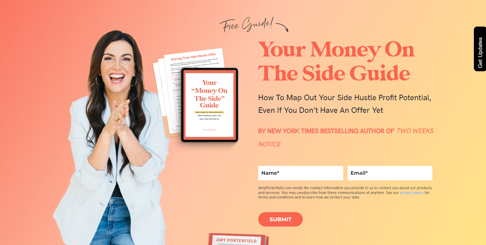
Even Amy Porterfield, arguably the list-building queen of the online business space, only collects two things on her opt-in form: your first name and your email address.
Tip 4: Showcase your opt-in’s benefits
I review a lot of opt-in pages, and one of the biggest mistakes I see people make is focusing solely on the lead magnet’s features while ignoring its benefits.
Instead of only sharing a bulleted list of what a subscriber gets inside your freebie, tell them why it’s worth knowing, accessing, or learning those things.
For example, instead “Get my top 5 tips for taking better iPhone photos” you might say something like “Learn how to take better iPhone photos of your busy kids, so you can capture treasured family memories on the go.”
By showing the reader how the information inside your lead magnet is going to benefit them, it instantly becomes more compelling.
Tip 5: Use a simple opt-in page design
This tip is applicable to all landing pages, but especially in the case of an opt-in page: you want to do everything you can to keep your visitor on the page.
At this point, you’ve worked pretty hard to capture the visitor’s attention and get them over to your website. That means your opt-in page’s only job should be to convert that visitor into a new email subscriber.
While it can be tempting to ask the visitor to take another action (like directing them to your Instagram, your shop, or your about page) it’s only going to detract them from taking the most important action: subscribing.
Remember: once you have that person on your email list, you can get them to take some other important action in your welcome sequence.
Keep the design and layout of your opt-in page simple by removing:
- Navigation menus, including your footer (be sure to keep links to your privacy policy)
- Any sidebars
- Any pop-ups
- Any in-text links (like “Read more” or “Find out more about me here”)
- Anything else that might make your visitor click away from your opt-in page
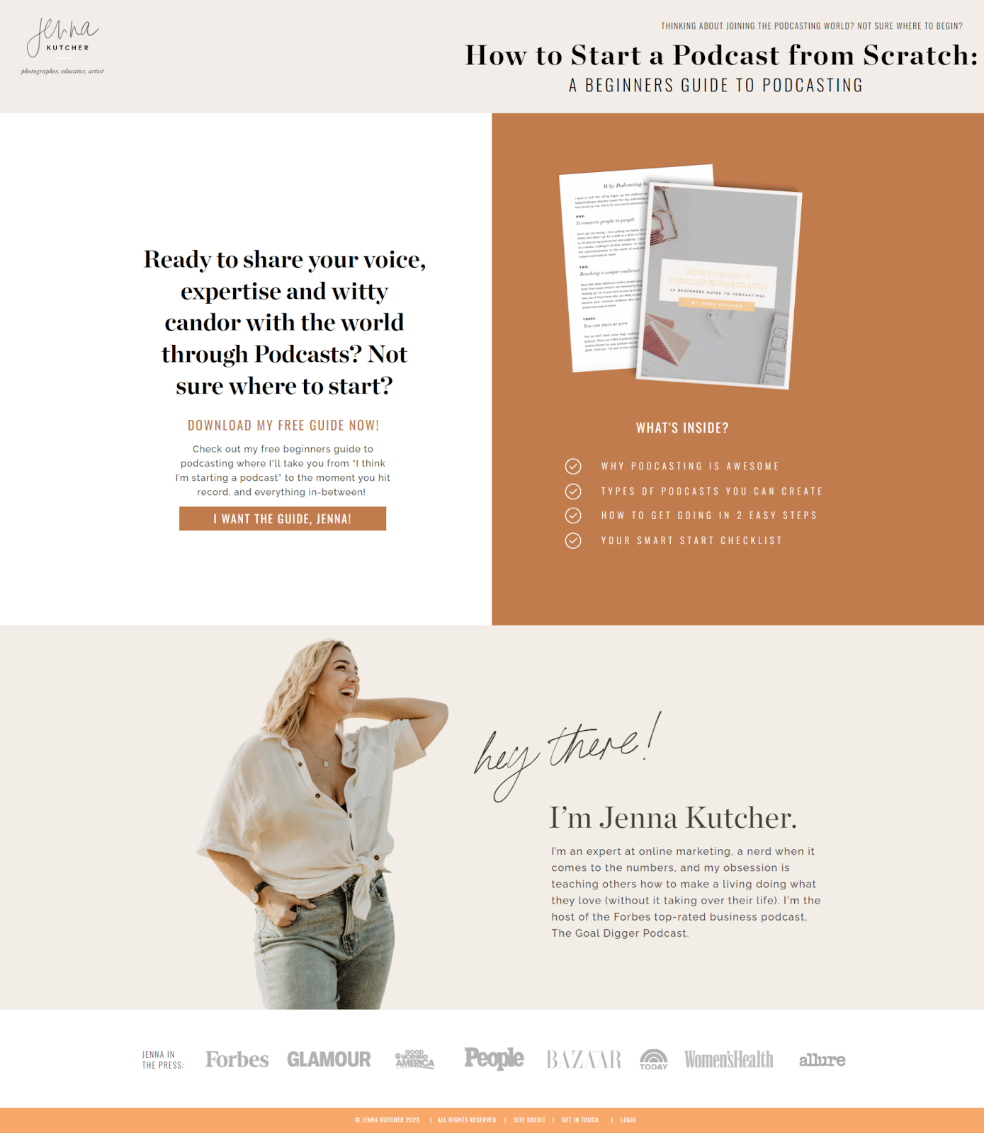
For example, take a look at Jenna Kutcher’s opt-in page for her Beginners Guide to Podcasting. Even though Jenna has tons of amazing courses, blog posts and podcast episodes, her only goal on this page is to get you to download her guide. So, any navigation totally disappears.
Tip 6: Use mockups and other visuals
Most lead magnets are not physical things, especially in the online business world. Which means it’s even more important to show your reader what they’re actually getting.
That doesn’t mean you have to show everything that’s in your freebie (otherwise it might defeat the purpose of asking them to opt in). But you can boost your conversion rate simply by showing the reader what your freebie looks like.
For most online entrepreneurs, your lead magnet is going to be some sort of digital download. I recommend creating a digital mockup of that download that shows visitors how they would use it in real life.
For example, if you’re offering a free set of Lightroom presets, you can show a set of before-and-after images on a phone. If it’s a workbook, show it on a tablet, or on a desk with a pen next to it.
Using a webinar as your lead magnet? Show the cover slide of your training or a screenshot from your presentation on a computer monitor.
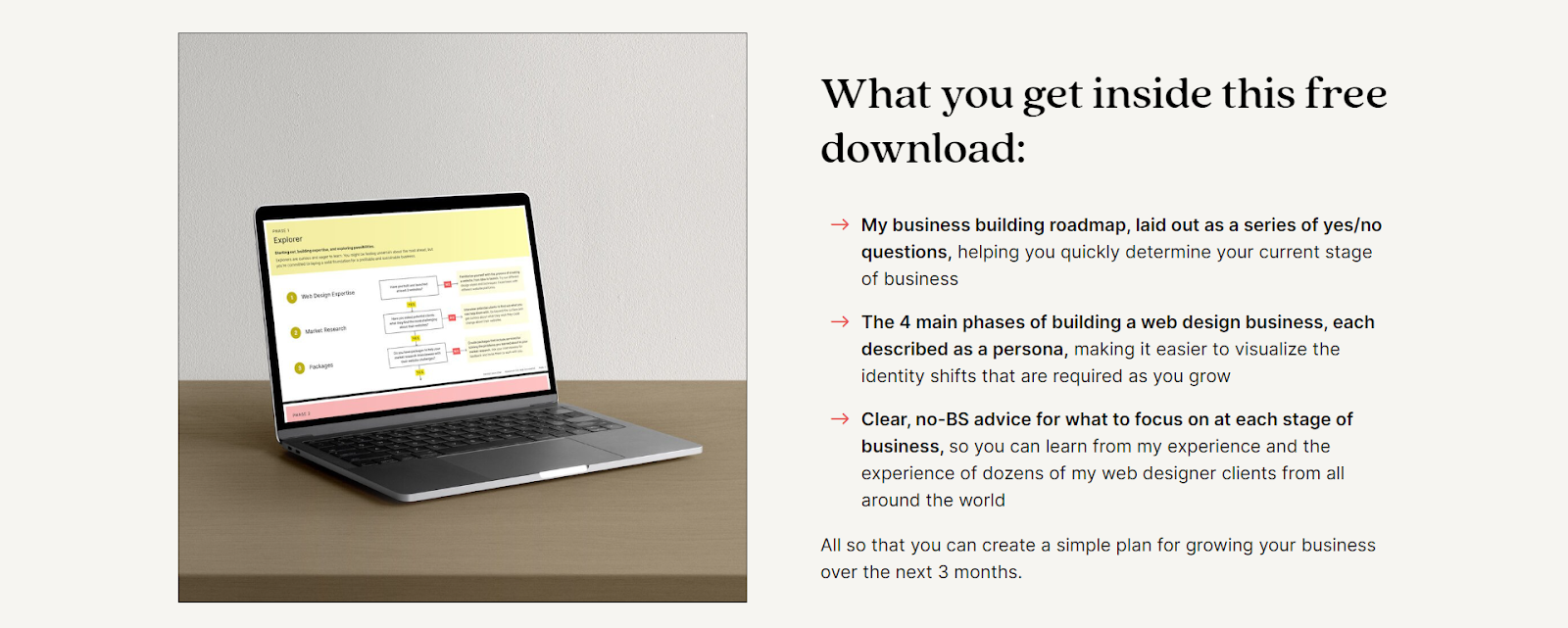
For example, on her opt-in page, Danbee Shin shows you exactly what her Roadmap for Web Designers will look like on your laptop after downloading it.
Tip 7: Don’t forget social proof
Yep, social proof isn’t just for your paid offers. By showing your opt-in page visitor that other people have loved your freebie and gotten results from it, it suggests that they will too!
Social proof can be a little bit harder to collect for lead magnets, because you’re less likely to have formal ways of collecting testimonials or product reviews. Instead, you can:
- Capture Facebook comments, Instagram DMs and other social media messages about your freebie
- Screenshot replies to your lead magnet delivery email (with permission)
- Use other forms of social proof, such as logos of media features you’ve received or notable clients you’ve worked with
You could even include a feedback request somewhere in your welcome sequence. Nothing fancy — just a quick line asking them to reply to your email if they thought the download was valuable.
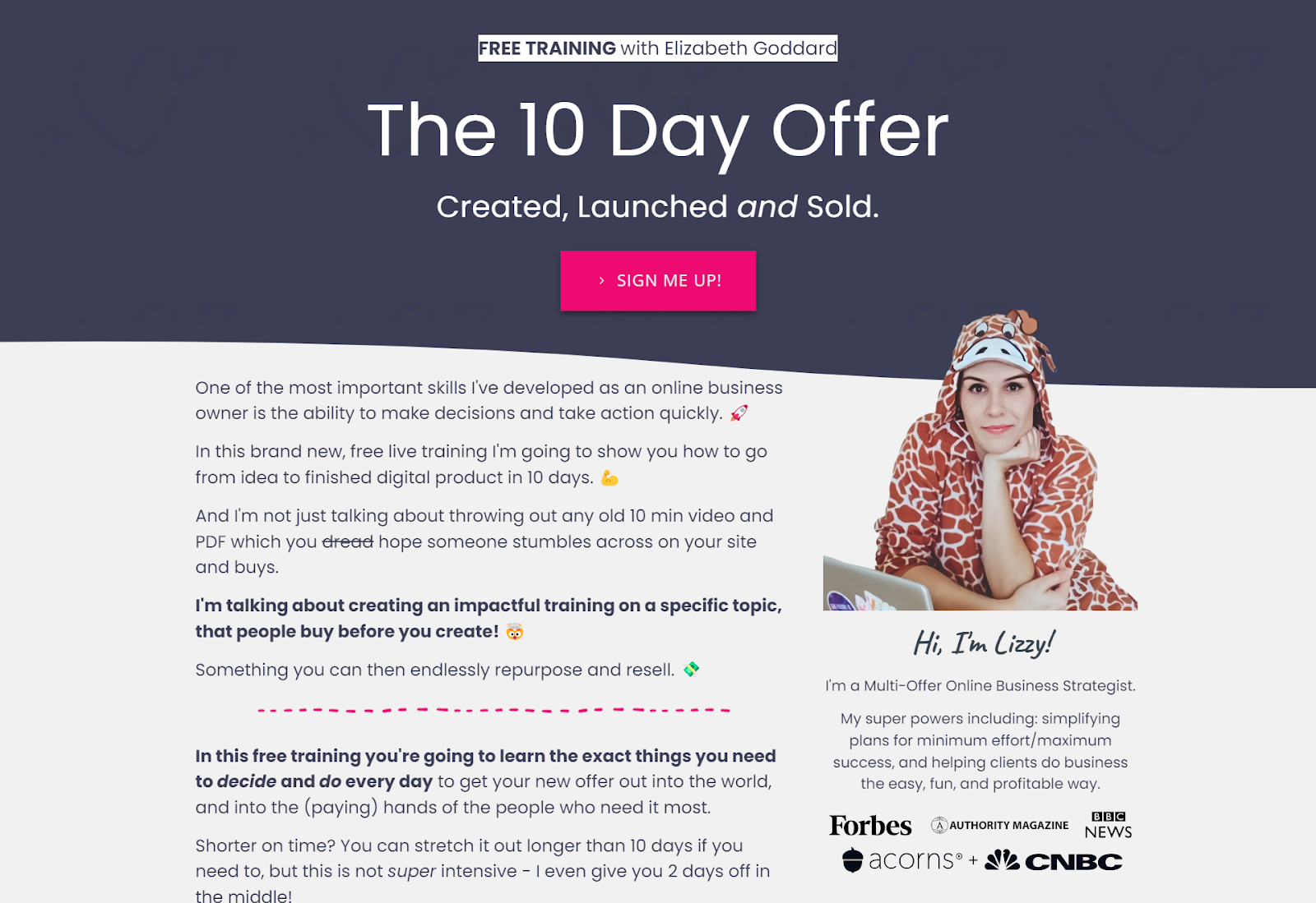
For example, Elizabeth Goddard uses logos from her media features on her opt-in pages to showcase that she’s someone worth trusting, particularly when trying to convert brand new leads.
Tip 8: Include your privacy disclaimer
This is less so a conversion tip and more so a legal requirement. Having some sort of disclaimer that links to your Privacy Policy is an absolute must to keep your opt-in page compliant.
Be sure to keep a link to your Privacy Policy in your footer. If you don’t have a Privacy Policy yet, I highly recommend checking out The Contract Shop (affiliate link).
I also suggest including a short privacy disclaimer on your opt-in page near the form. Here’s some copy you can swipe:
“By downloading this [workbook/guide/video/checklist], you agree to receive the occasional email from [your business name]. We promise to keep your information 100% secure, and you can unsubscribe at any time. Click here for our full Privacy Policy.”
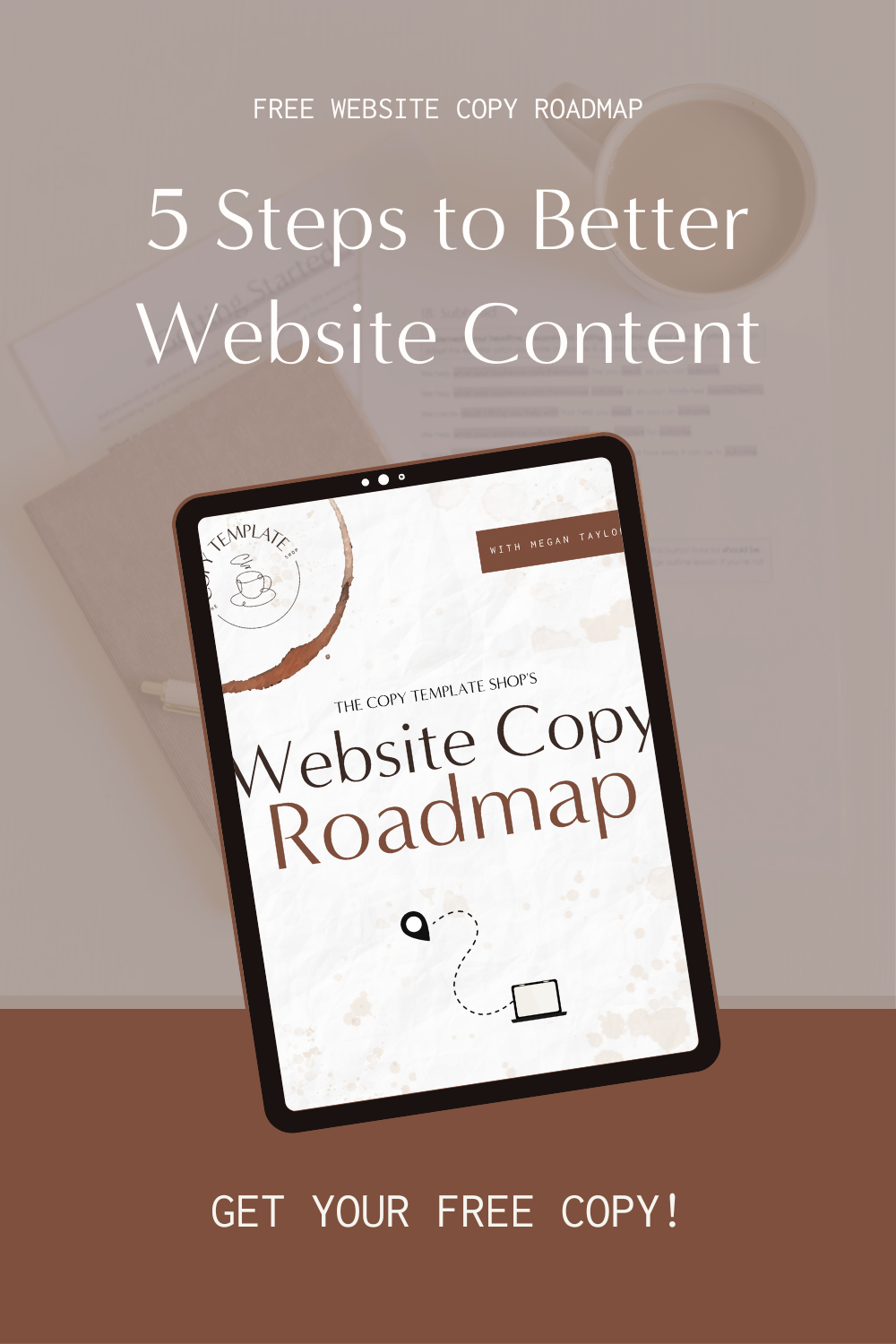
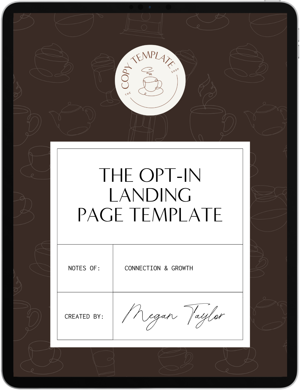
Create your opt-in page in minutes (not days)
Ready to optimize your opt-in landing page for more conversions? You can do it a lot faster with our Opt-In Landing Page Copy Template. It’s based on all of the conversion best-practices covered here, so you can start converting more visitors into subscribers in under an hour.
And remember: optimization is an ongoing process. Don’t forget to track metrics like your opt-in page’s conversion rate, bounce rate, and time on page to keep your page effective. Sometimes the smallest tweaks can have the most powerful impact!

1 Comment on 8 Tips for Optimizing Your Opt-In Page to Maximize Lead Generation
Comments are closed.